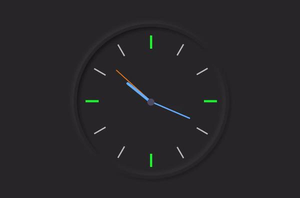
用HTML、CSS和JavaScript实现了简单的模拟时钟


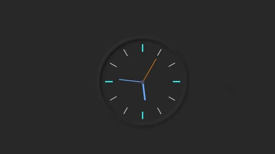
在本文中,我将向大家展示如何使用HTML、CSS和JavaScript代码制作模拟时钟。我之前设计过很多类型的模拟时钟。这一款的形状采用黑色新拟物风格设计。用三个指针来表示小时、分钟和秒。此时钟盘面使用了符号而不是1到12的数字。
在我使用了新拟物风格设计制作之后,时钟的背景和页面的背景我也使用了相同的颜色。首先,我在网页上制作一个30rem宽和30rem高的盒子。border-radius: 50%用于环绕此框。我在这里使用了box-shadow来实现新拟物风格设计。
是不是感觉很简单?下面我将一步步展示如何制作模拟时钟。首先创建一个HTML和CSS文件。确保将你的CSS文件附加到html文件中。
我使用以下HTML和CSS代码来制作这个模拟时钟的背景。使用代码<div class = "clock"></div>创建这个时钟的结构。我先在CSS代码中给出页面的背景颜色(background: #282828;)。
<div class="clock">

</div>
html {
  background: #282828;
  text-align: center;
  font-size: 10px;
}

body {
  margin: 0;
  font-size: 2rem;
  display: flex;
  flex: 1;
  min-height: 100vh;
  align-items: center;
}

.clock {
  width: 30rem;
  height: 30rem;
  position: relative;
  padding: 2rem;
  border: 7px solid #282828;
  box-shadow: -4px -4px 10px rgba(67,67,67,0.5),
                inset 4px 4px 10px rgba(0,0,0,0.5),
                inset -4px -4px 10px rgba(67,67,67,0.5),
                4px 4px 10px rgba(0,0,0,0.3);
  border-radius: 50%;
  margin: 50px auto;

}
我使用以下HTML和CSS代码来制作表示时间的符号。首先,使用以下代码制作两条线。并把这两条线放置为相互成90度角。再通过background: #282828使线条更亮。
<div class="outer-clock-face">

</div>
.outer-clock-face {
  position: relative;
  background: #282828;
  overflow: hidden;
  width: 100%;
  height: 100%;
  border-radius: 100%;
}

.outer-clock-face::after {
  -webkit-transform: rotate(90deg);
  -moz-transform: rotate(90deg);
  transform: rotate(90deg)
}

.outer-clock-face::after,
.outer-clock-face::before,
.outer-clock-face .marking{
  content: '';
  position: absolute;
  width: 5px;
  height: 100%;
  background: #1df52f;
  z-index: 0;
  left: 49%;
}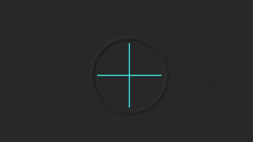
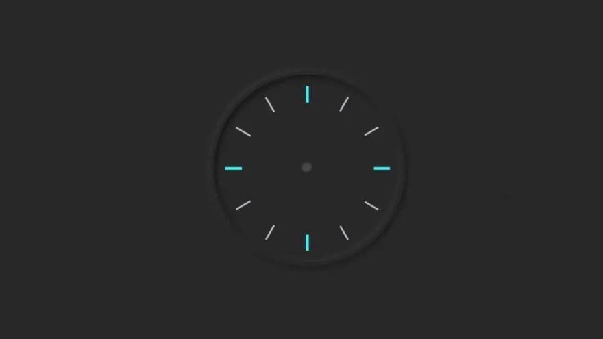
我使用以下HTML和CSS代码在这个时钟上又制作了4条线。通过CSS代码,我根据需要调整了这些线的角度。我用的是白色,你也可以用其他颜色。
<div class="marking marking-one"></div>
<div class="marking marking-two"></div>
<div class="marking marking-three"></div>
<div class="marking marking-four"></div>
.outer-clock-face .marking {
  background: #bdbdcb;
  width: 3px;
}

.outer-clock-face .marking.marking-one {
  -webkit-transform: rotate(30deg);
  -moz-transform: rotate(30deg);
  transform: rotate(30deg)
}

.outer-clock-face .marking.marking-two {
  -webkit-transform: rotate(60deg);
  -moz-transform: rotate(60deg);
  transform: rotate(60deg)
}

.outer-clock-face .marking.marking-three {
  -webkit-transform: rotate(120deg);
  -moz-transform: rotate(120deg);
  transform: rotate(120deg)
}

.outer-clock-face .marking.marking-four {
  -webkit-transform: rotate(150deg);
  -moz-transform: rotate(150deg);
  transform: rotate(150deg)
}
我在这个钟的中间制作了一个圆圈。这个圆的圆心位于预先绘制的这些线条的交汇处。由此产生的线条作为符号。
<div class="inner-clock-face">

</div>
.inner-clock-face {
  position: absolute;
  top: 10%;
  left: 10%;
  width: 80%;
  height: 80%;
  background: #282828;
  -webkit-border-radius: 100%;
  -moz-border-radius: 100%;
  border-radius: 100%;
  z-index: 1;
}

.inner-clock-face::before {
  content: '';
  position: absolute;
  top: 50%;
  left: 50%;
  width: 16px;
  height: 16px;
  border-radius: 18px;
  margin-left: -9px;
  margin-top: -6px;
  background: #4d4b63;
  z-index: 11;
}
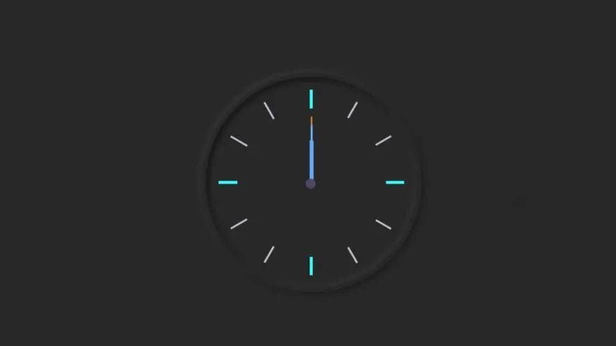
和普通的模拟时钟一样,我用3个指针来表示小时、分钟和秒。我使用以下HTML和CSS代码创建和设计指针。
<div class="hand hour-hand"></div>
<div class="hand min-hand"></div>
<div class="hand second-hand"></div>
.hand {
  width: 50%;
  right: 50%;
  height: 6px;
  background: #61afff;
  position: absolute;
  top: 50%;
  border-radius: 6px;
  transform-origin: 100%;
  transform: rotate(90deg);
  transition-timing-function: cubic-bezier(0.1, 2.7, 0.58, 1);
}

.hand.hour-hand {
  width: 30%;
  z-index: 3;
}

.hand.min-hand {
  height: 3px;
  z-index: 10;
  width: 40%;
}

.hand.second-hand {
  background: #ee791a;
  width: 45%;
  height: 2px;
}
到现在为止,我们已经完成了时钟的设计工作。现在我们将在JavaScript的帮助下实现这个模拟时钟。这里我没有使用任何插件或JavaScript库。我只是使用JavaScript让指针运动起来。即使你是初学者,也可以理解这样的设计。我在每段代码下面对为什么我要这样使用代码给出了完整的解释。
我们将使用querySelector()获取以下内容的引用:
➤.second-hand ➤.min-hand➤.hour-hand`
const secondHand = document.querySelector('.second-hand');
const minsHand = document.querySelector('.min-hand');
const hourHand = document.querySelector('.hour-hand');
function setDate() {
const now = new Date();➤ new Date()创建了Date类的实例,然后我们可以从中获取各种信息,例如当前日期、小时、分钟、秒等。
const seconds = now.getSeconds();
const secondsDegrees = ((seconds / 60) * 360) + 90;
secondHand.style.transform = `rotate(${secondsDegrees}deg)`;➤ 将秒针如何旋转存储在secondsDegrees中。
➤ 然后使用rotate(${secondsDegrees}deg)旋转秒针。
➤ 除以60,因为1分钟等于60秒。
➤ 乘以360,因为圆由360度构成。
const mins = now.getMinutes();
const minsDegrees = ((mins / 60) * 360) + ((seconds/60)*6) + 90;
minsHand.style.transform = `rotate(${minsDegrees}deg)`;setInterval(setDate, 1000); setDate();
➤ 我们需要每1秒(1000 milliseconds)调用一次rotate()函数。
最终的Javascript代码
const secondHand = document.querySelector('.second-hand');
const minsHand = document.querySelector('.min-hand');
const hourHand = document.querySelector('.hour-hand');
 function setDate() {
  const now = new Date();
const seconds = now.getSeconds();
const secondsDegrees = ((seconds / 60) * 360) + 90;
secondHand.style.transform = `rotate(${secondsDegrees}deg)`;
const mins = now.getMinutes();
const minsDegrees = ((mins / 60) * 360) + ((seconds/60)*6) + 90;
minsHand.style.transform = `rotate(${minsDegrees}deg)`;
const hour = now.getHours();
const hourDegrees = ((hour / 12) * 360) + ((mins/60)*30) + 90;
hourHand.style.transform = `rotate(${hourDegrees}deg)`;
}
setInterval(setDate, 1000);

setDate();